Case Study
Building a cohesive brand identity for wellness and personal care products.

Project
Rebranding Strategy
Industry
Wellness & Personal Care
Scope
Visual Identity
Packaging Design
Art Direction
b-Inspired wanted to refresh their brand identity to better reflect their evolving vision in the wellness space. Over time, their branding and packaging required consistency and a strong shelf presence.
The objective was to reposition b-Inspired with a modern, cohesive identity that communicates trust, wellness, and quality, while maintaining consistency for existing customers.
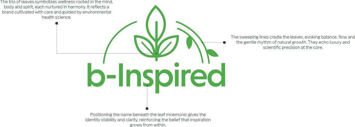
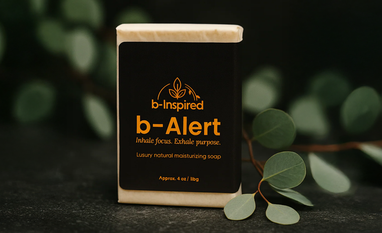
We developed a fresh logo and an integrated brand language, including colors, typography, and design style.

Defining a core color palette and typography system that speaks of modern wellness values.

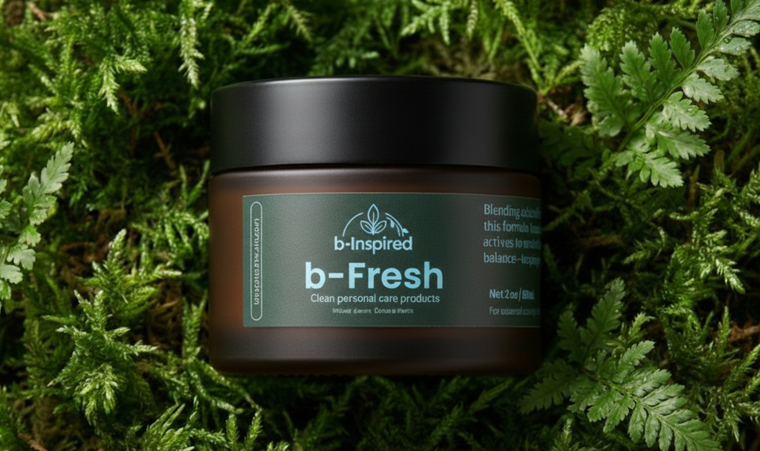
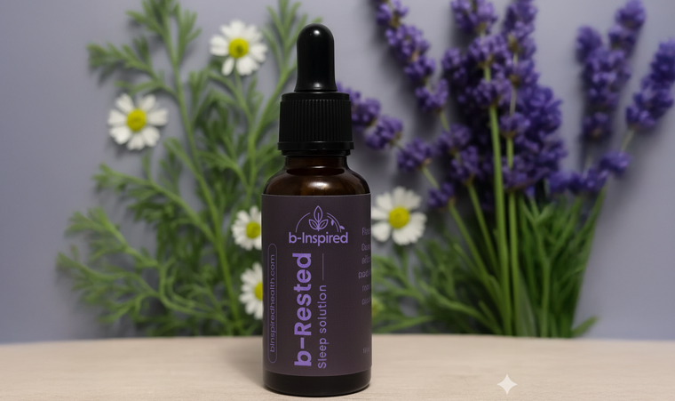
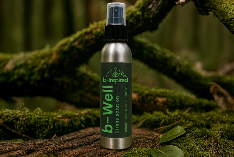
Created a versatile layout across all SKUs, ensuring easy recognition and scalability.

Special focus on differentiation and shelf appeal while maintaining a clean aesthetic.